
First let me be clear that I’m extremely excited for Spider-man: Homecoming. I honestly think it will be the best Spidey movie yet, now that Marvel has more control over the character.
That being said, Sony Pictures released two new posters a couple days ago along with a trailer and holy cow are they a hot mess:
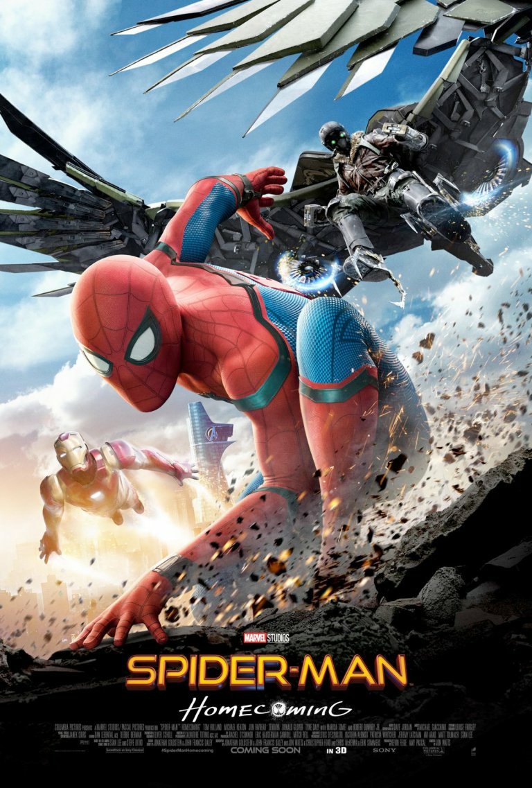
Poster A

Wow. This poster couldn’t be more of a cluster…or poorly designed in general. Did one of the higher-ups at Sony let their high school kid design It? There’s so many possibilities for sarcastic questions:
-I thought Ironman was going to be in this movie? I don’t think the FOUR references on one poster are enough…
-Speaking of Ironman, is Tony on fire? He doesn’t seem concerned.
-I guess that’s the sun behind Vulture? He looks like he’s flying out of Tony’s heart. Aw, how sweet.
-Michael Keaton has a little man on his shoulder that shoots force lighting? Oh I guess that’s supposed to be the Spidey villain, Shocker. (You just CAN’T do a Spider-man film with only one villain, can you, Sony?)
-Spider-man is about to run a marathon..with the sun behind him…wait how many suns are there? Or, maybe Spidey is running because HE’S the one on fire!? Quick, stop, drop, roll, Peter!
I could keep going, but you get the idea.
Poster B
Same here with the graphic design quality. It looks “better” than the first poster, but still seems amateur. If you told me this was a fan made poster I would believe it 100%.
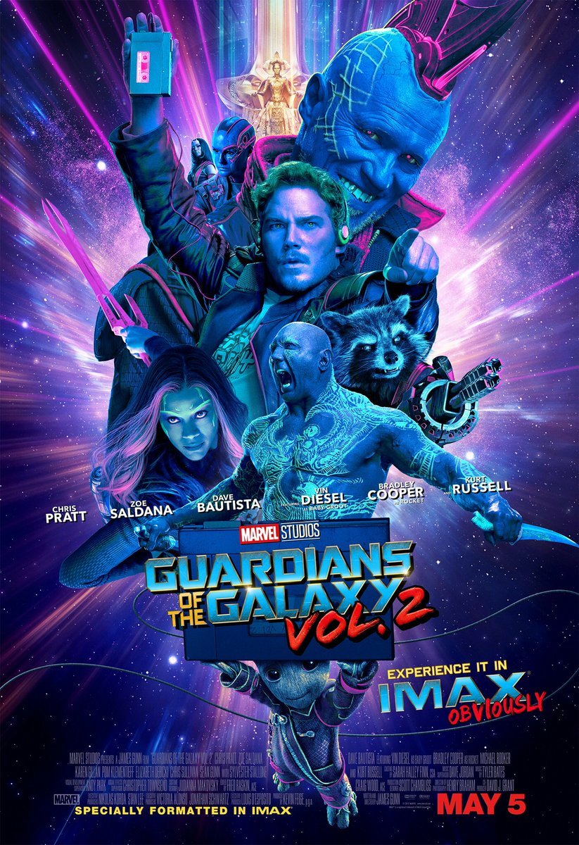
Now let’s try to cleanse the palette with a few examples done right.
Guardians of the Galaxy Vol 2 has some of the most interesting posters I’ve seen in a long time. Now here’s how you do a group shot. This is sexy:
Here’s even one by the competetion: the recently released Wonder Woman poster. It’s very simple, but is a powerful image that’s been designed well, with a great mix of colors. In fact, most of the movie’s posters have been simple: focusing only on her, which was a smart choice. Less is more, as they say (get your mind out of the gutter).

Come on Sony. Does Marvel have to do everything for you? There’s a lot riding on this movie for Sony. I’m very suprised these posters were released in this quality. If the posters look this sloppy let’s hope Marvel had a little more control over the actual movie. At least the trailer looks good. Check it out here.
Spider-man: Homecome releases July 7th in theaters.

